Visual Strategy
Defining what needs to be seen, understood and felt.
Communication strategy
Art direction
Brand framing & Storytelling
Creative direction & Leadership
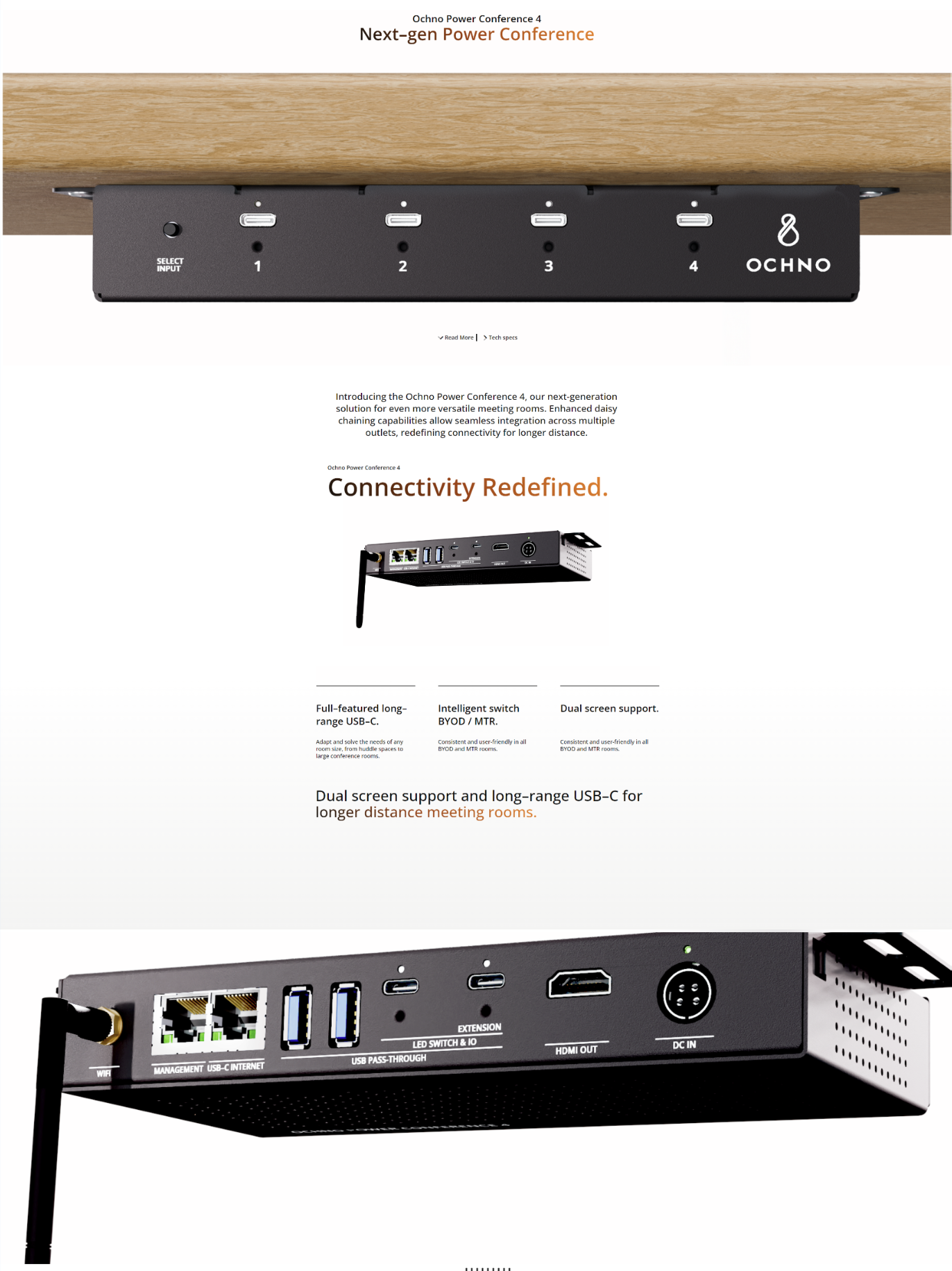
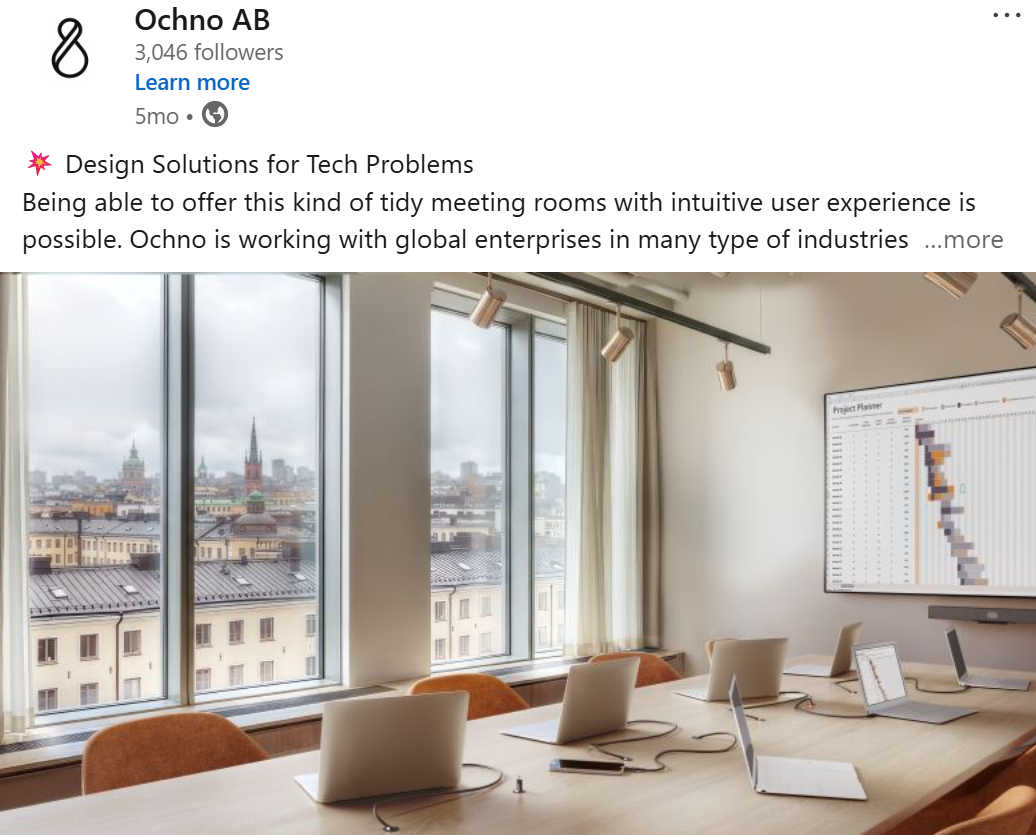
Case 1: Ochno
Ochno is a Swedish tech and innovation company that provides design solutions for tech problems; simplifying collaboration through intuitive, hassle-free digital solutions. From pioneering smart meeting solutions to wider workplace innovation, we aim to transform how we work.
Ochno had a very strong graphical profile. A strong recognizable logo, and a distinguishable orange color or mandarin to be specific, that can be scene in all their visual materials.
When I started helping Ochno, I realized that other than the graphical profile the brand visual identity in all other areas was not present. Making the brand experience weak as a result.
I showcase bellow how we tackled each part of the visual identity and the brand experience.
Visual Identity Assessment - Before
Visual Identity Assessment - After
Brand Imagery
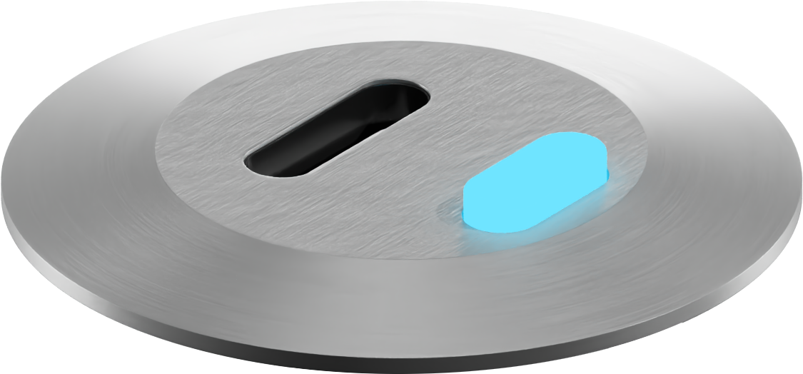
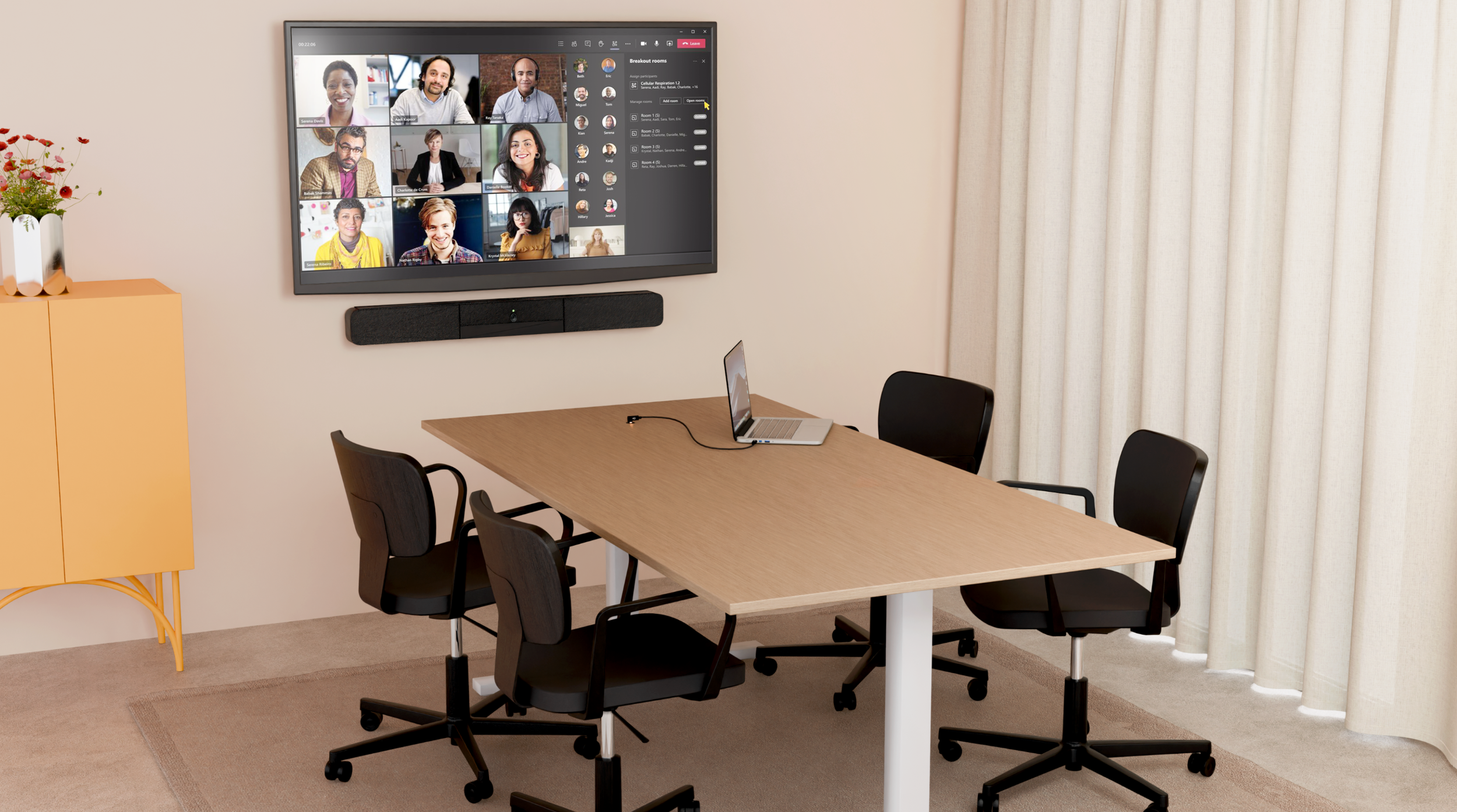
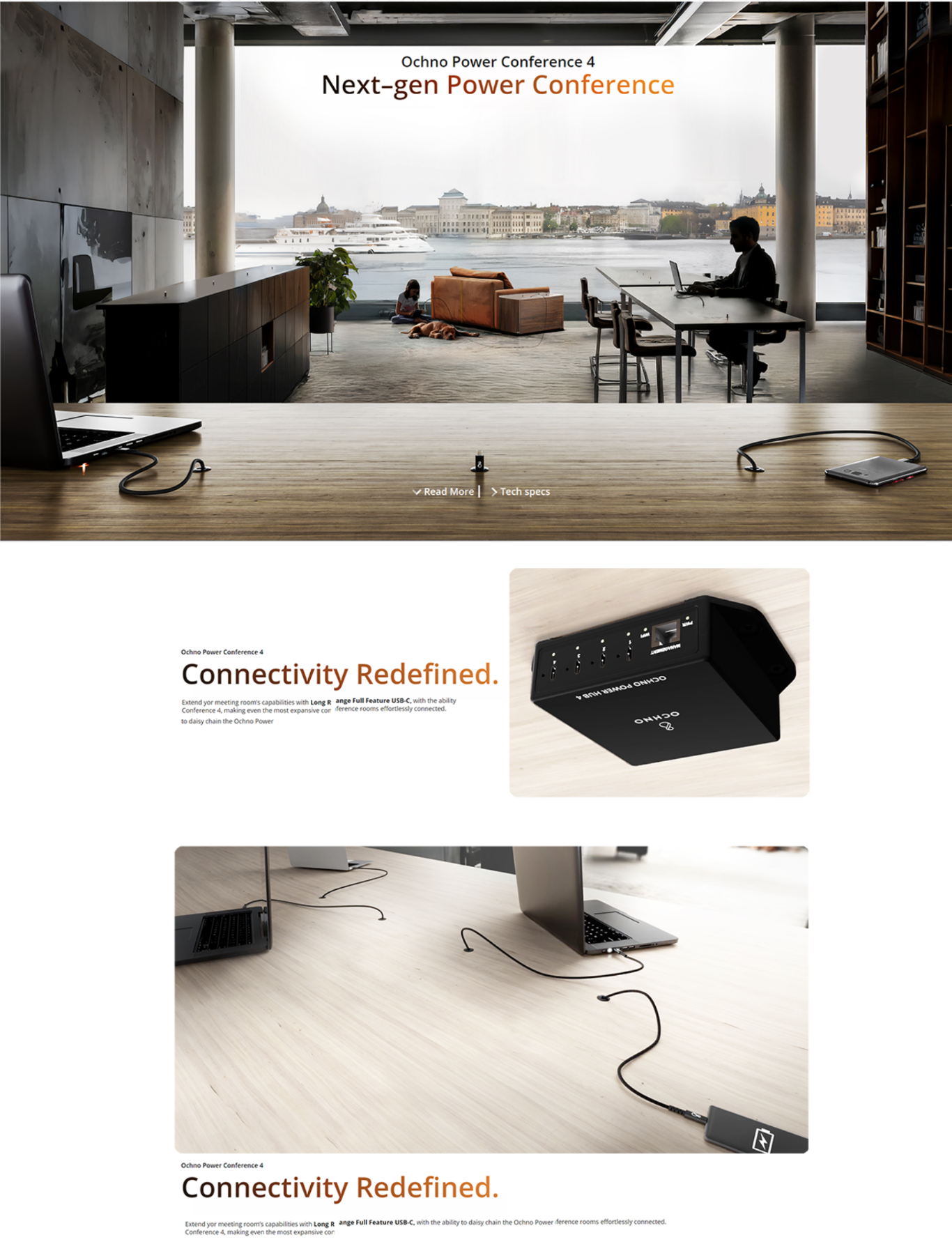
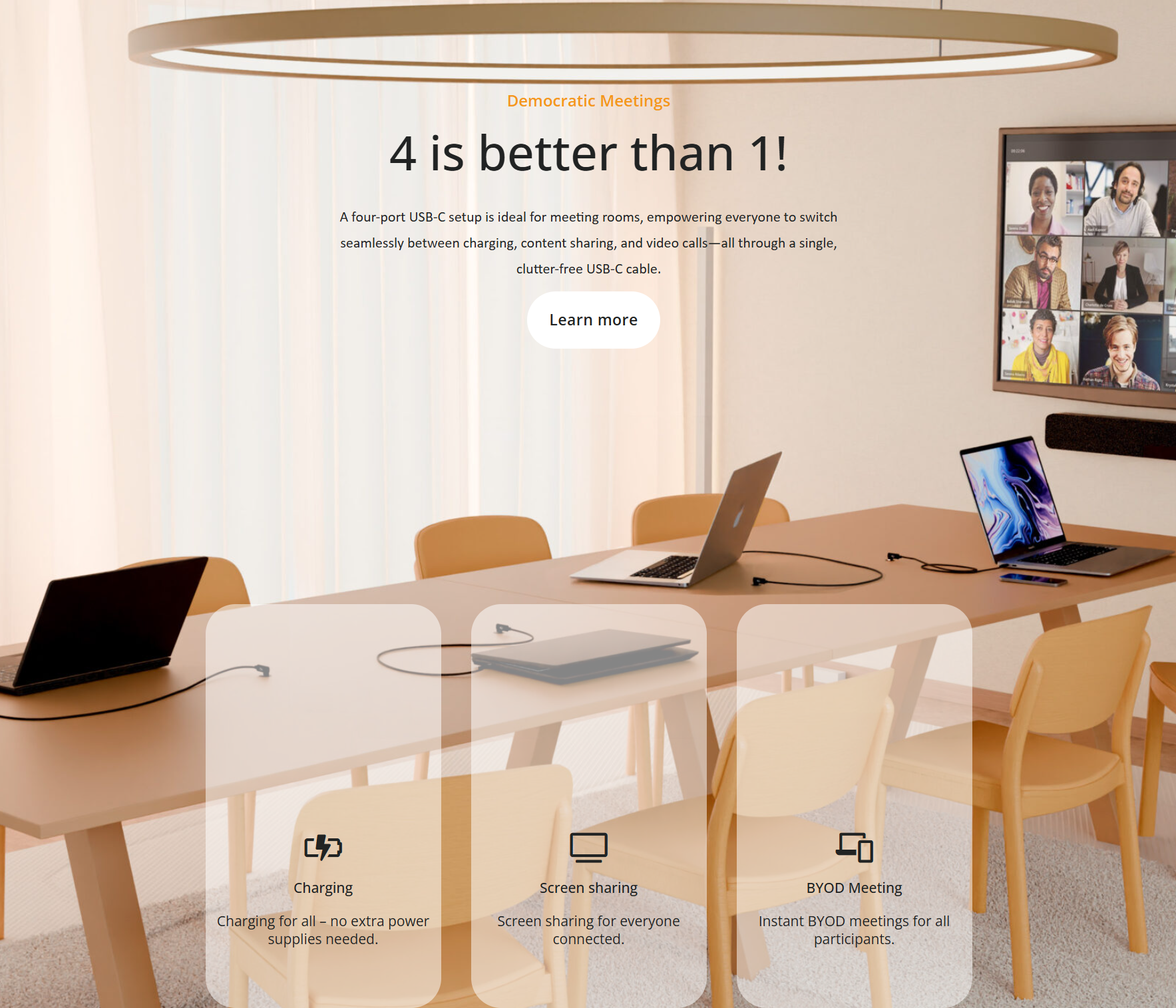
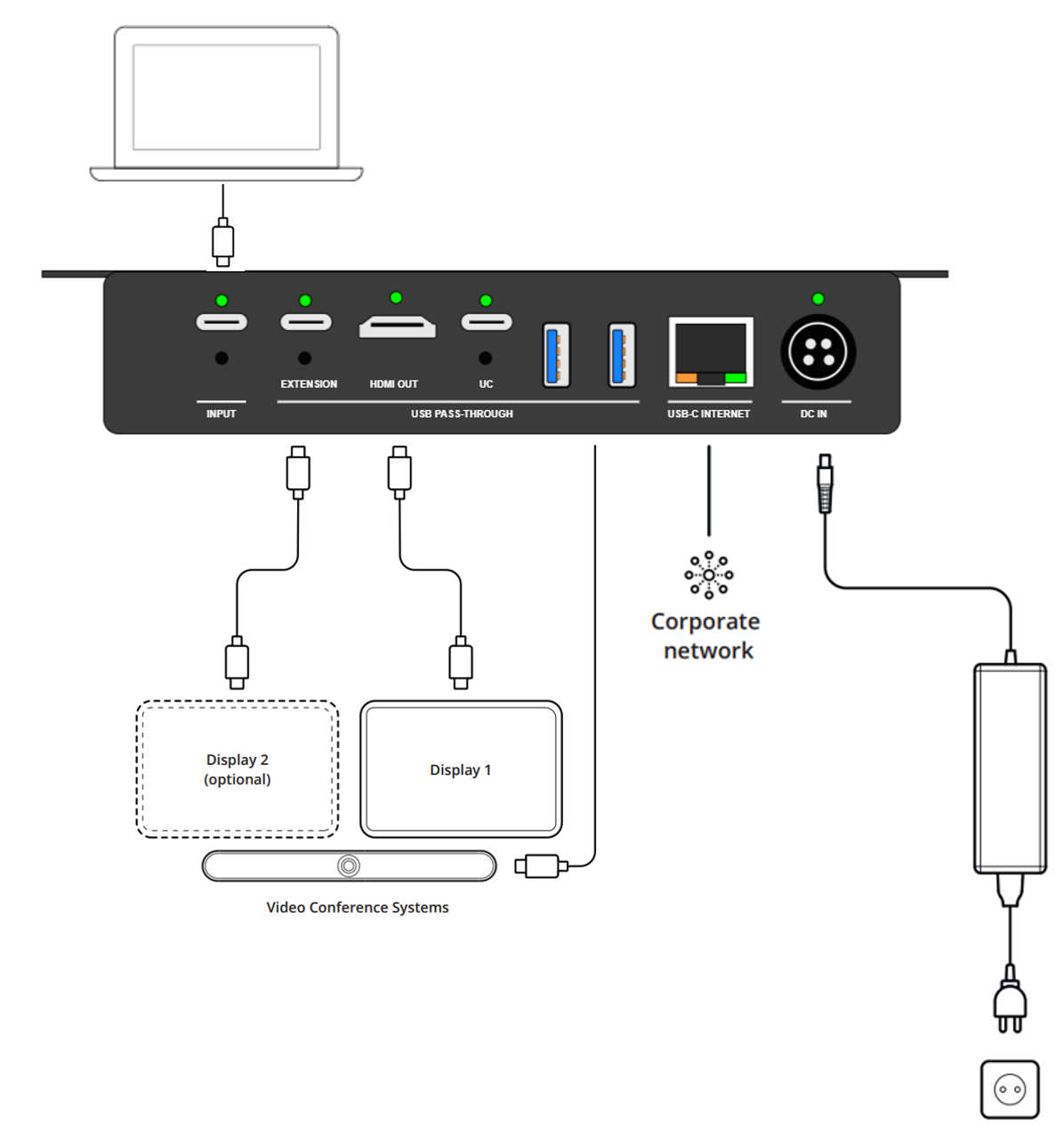
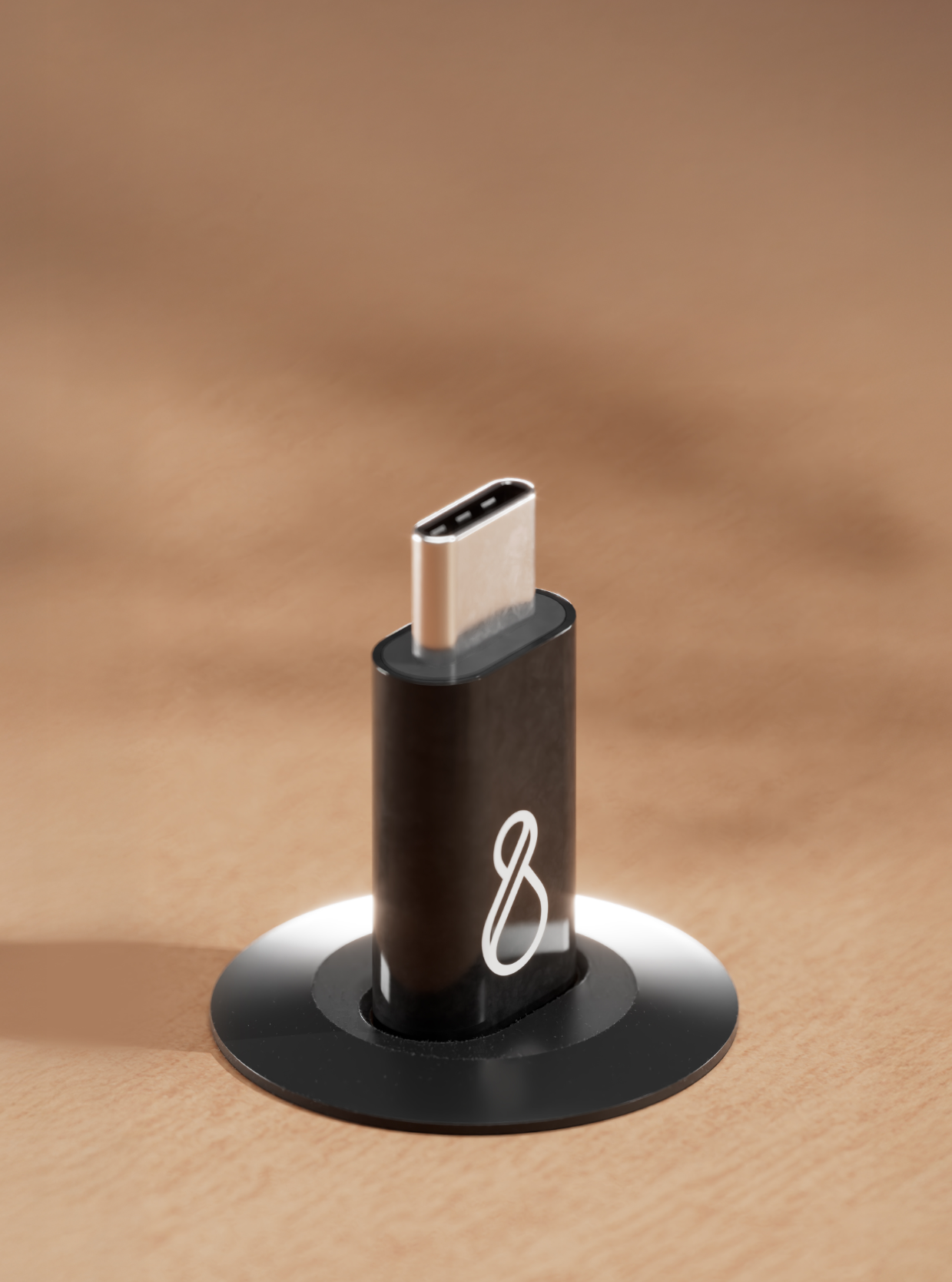
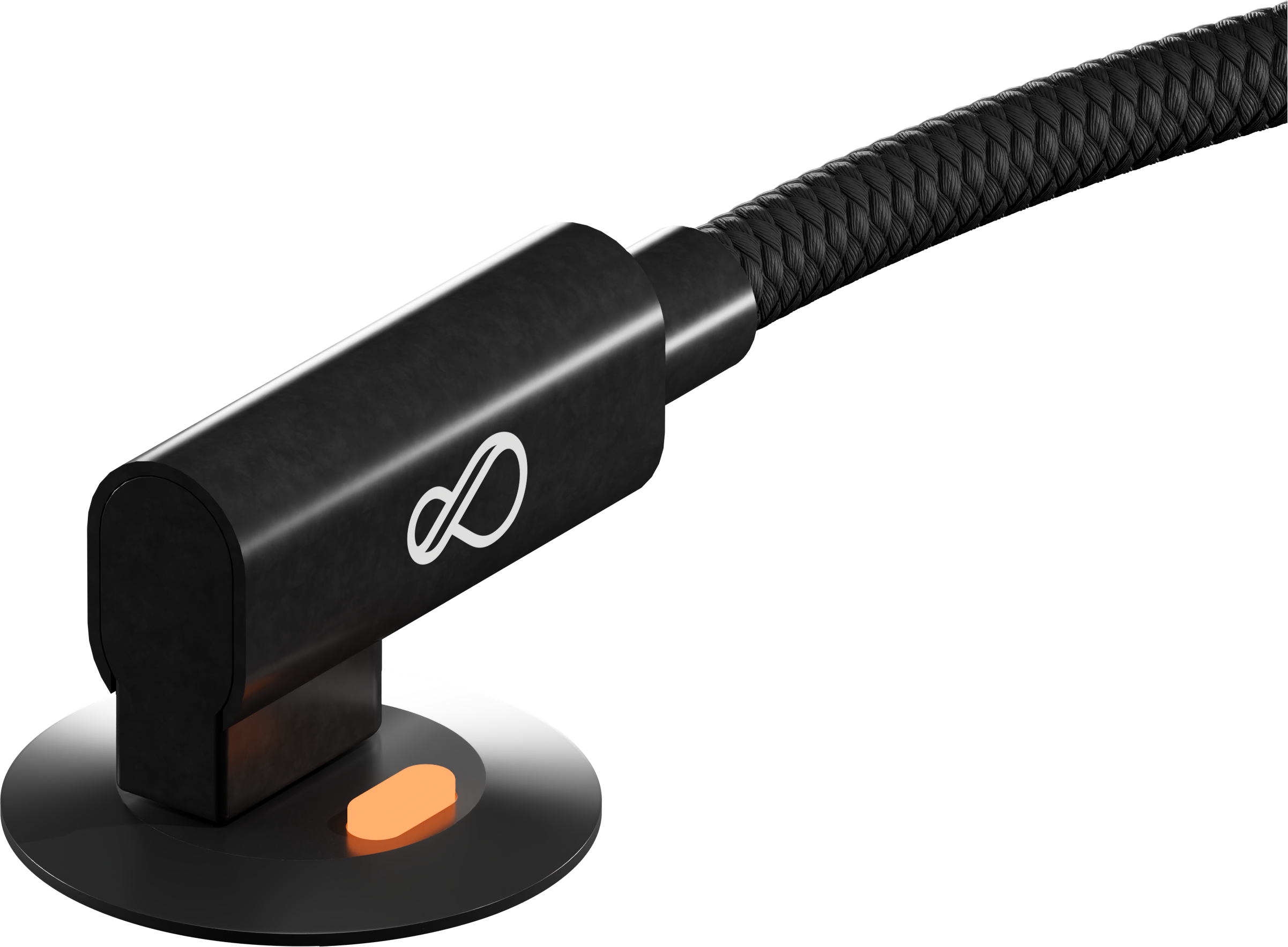
Ochnos USB-C Products are smart and hidden by design, they are located under working desks. Instead of showing the product itself we started to show its impact. A clean minimalistic desk. Ochno create a place that is inspiring to work at.
Before
After
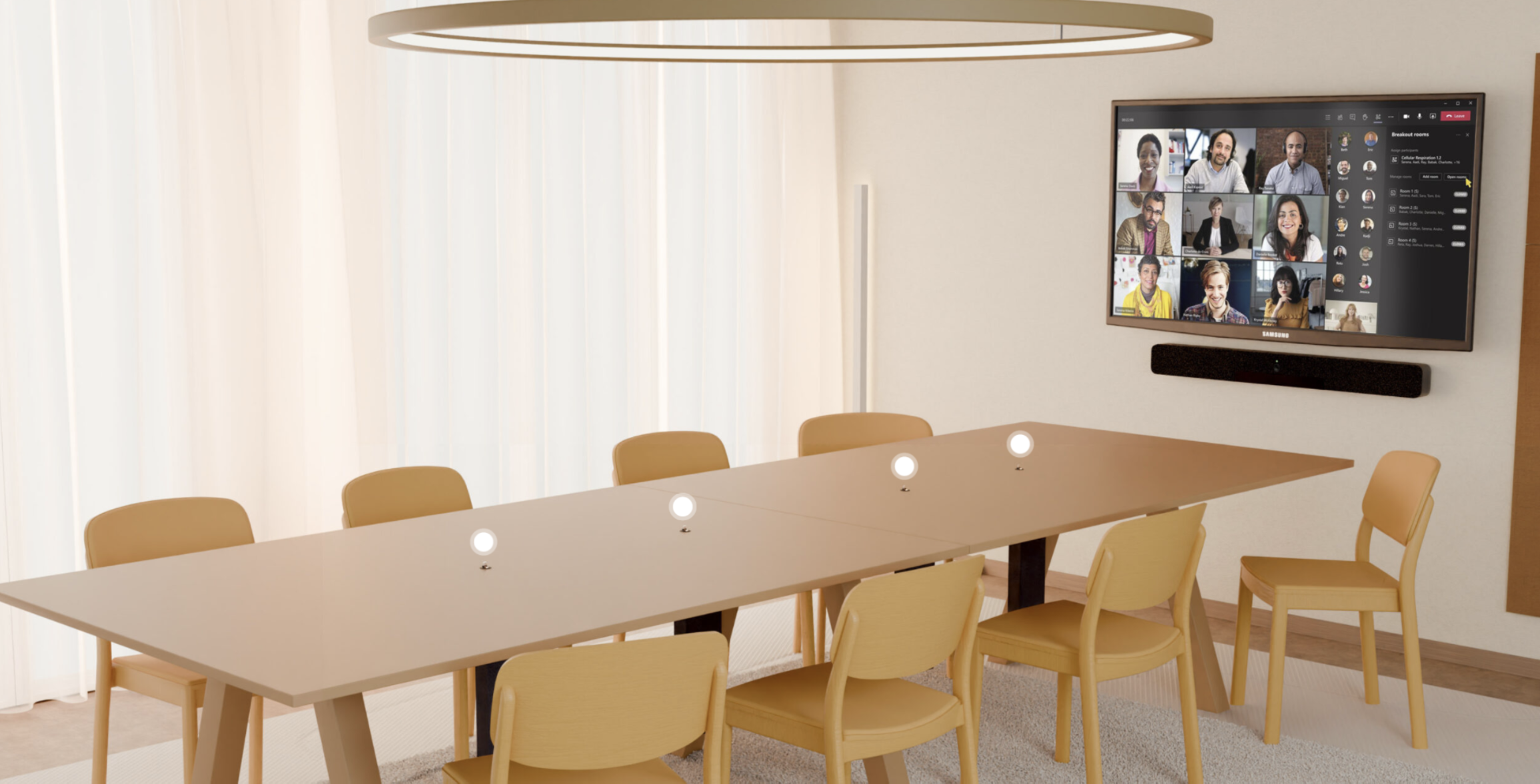
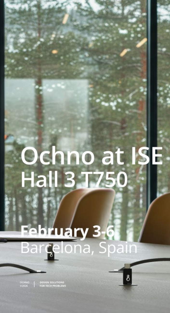
Ochno is Scandinavian. Another thing that needed to be highlighted in its presentation. We moved showing the product a generic meeting rooms and workplaces to a place that has the Nordic nature, cities and its unique environment.
Before
Before
Changing focal length, camera position, and framing removes the room and introducing the environment, visual weight shifts from the space itself to the relationship between the product and its context.
Before: The room is the subject.
After: The product and its environment become the story.
Appreciating the object itself. Restraint, proportion, and material honesty. Those are the things that make it feel elegant.
Product Imagery
From tH!s…………………………………………….……………………………………………………………..…………To this
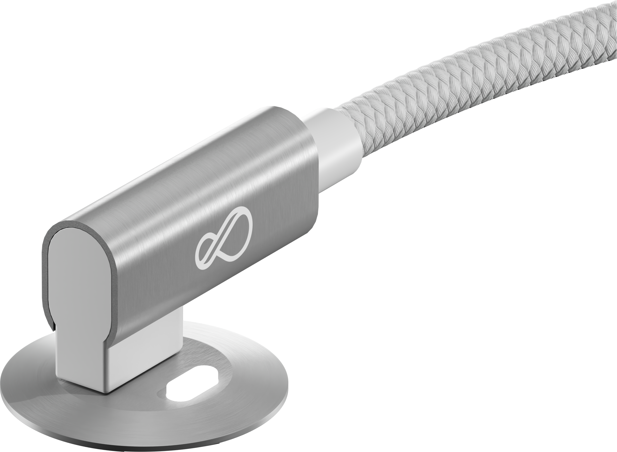
Visual weight
Conceptual Clarity and User experience
After

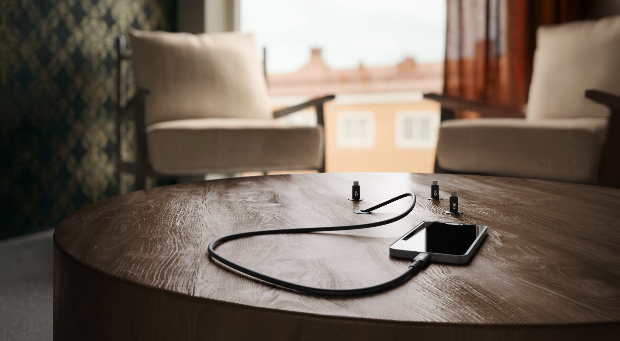
Emotional Resonance
A USB-C cable is a dry and boring product. We had to highlight everything around it. The power it gives, the clean desk, the beautiful wood the relaxed room and the warm ambient light that comes from the big windows.

After
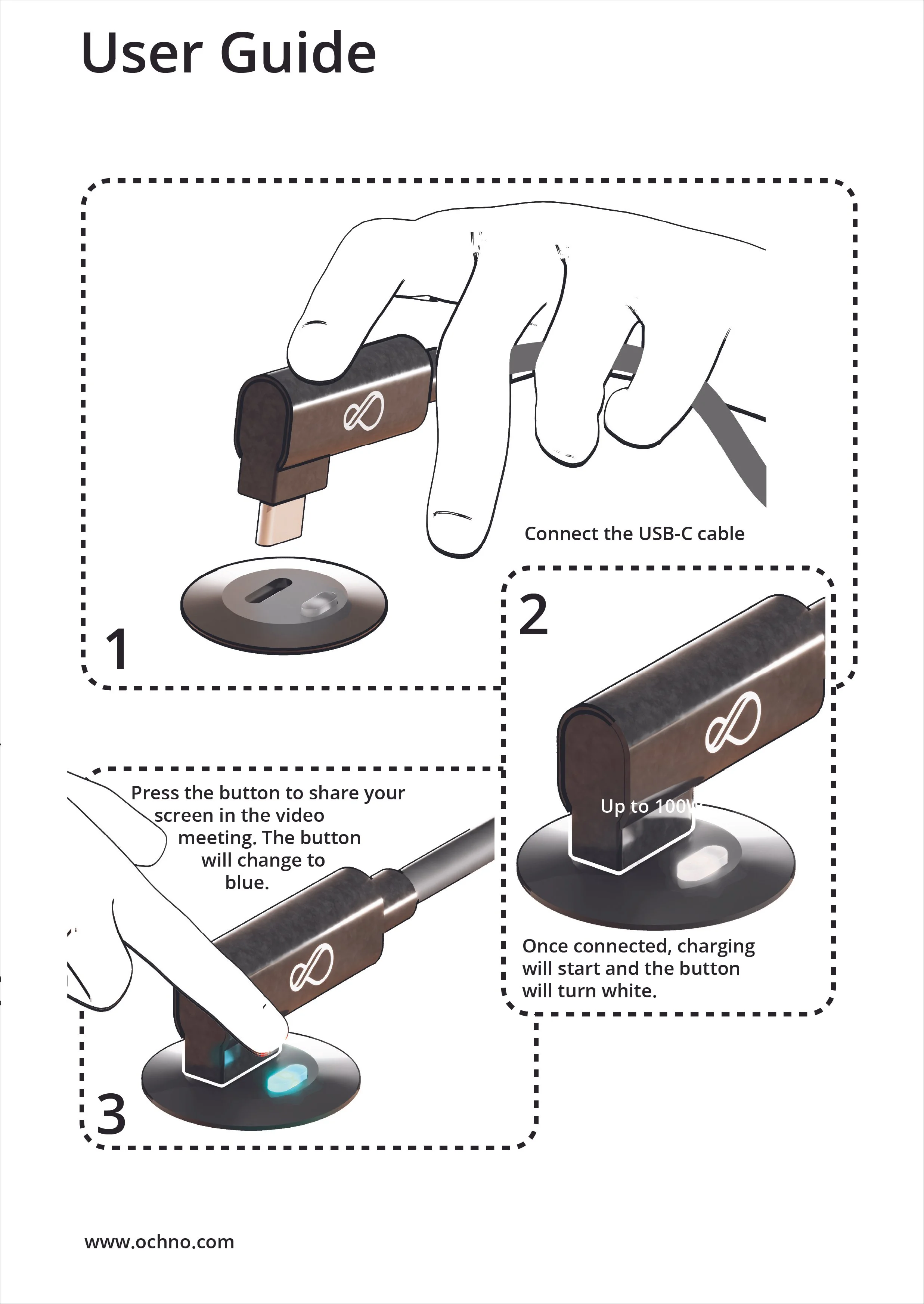
We created 3d animations and illustrations that can showcased how the product work. It should inspire those who are non technical yet convince those who are experts in Audio Video field.
The script aimed to check the following:
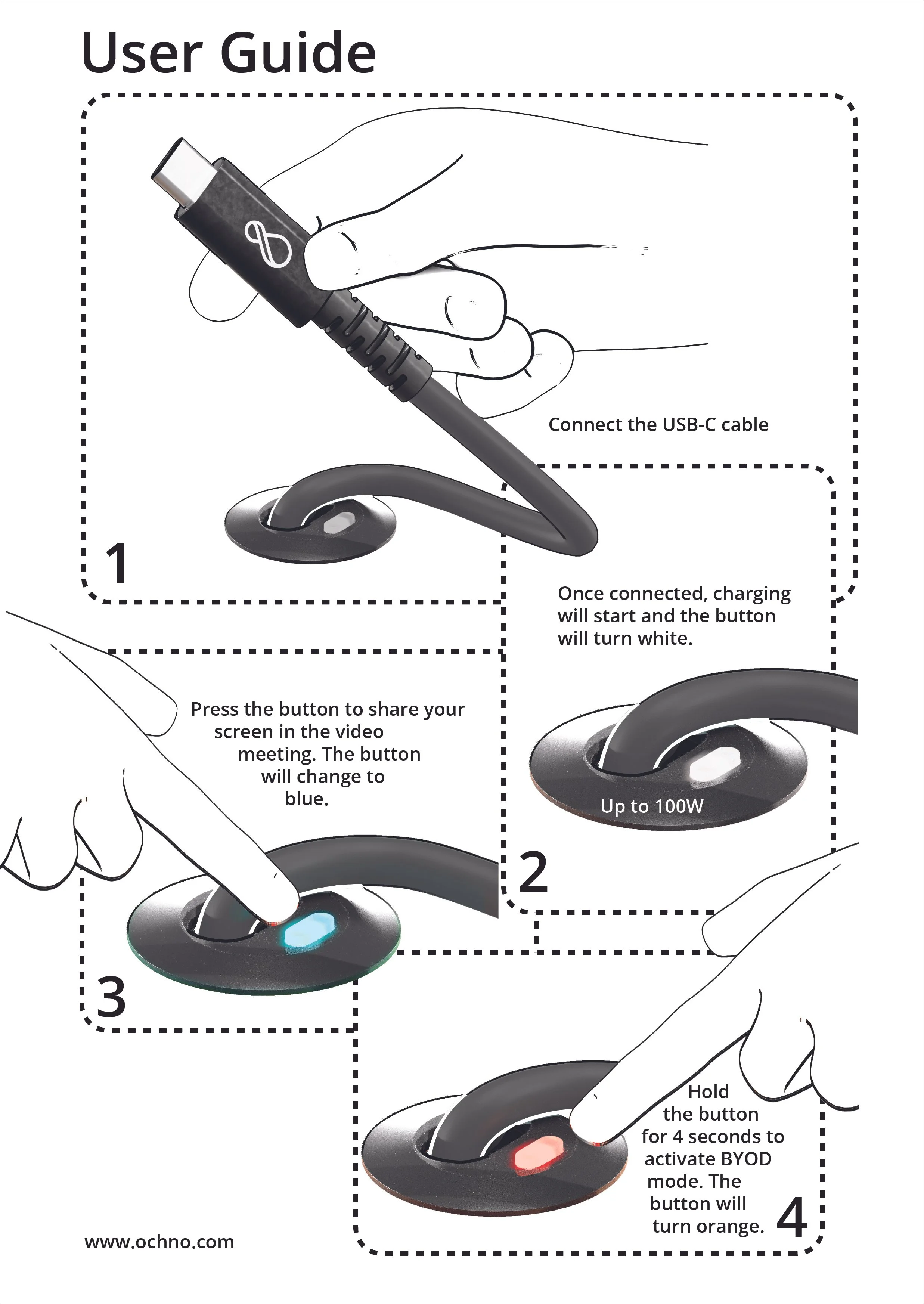
Product advertisement for social media.
Getting started with Ochno product.
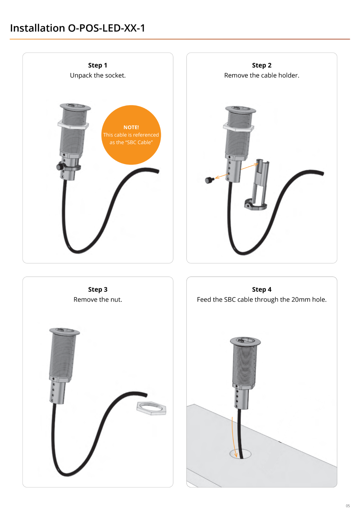
Installation guide.
Room transformation guide.
Exhibition material on the big screen.
Case 2: lykke kaffegårdar
A campaign for the workplace
Challenge
Breaking through the noise in a competitive market where sustainable coffee is often available at lower prices, and where office coffee is typically seen as a given rather than an investment. Our challenge is to build brand awareness and drive engagement for Lykke, particularly in an environment where coffee rarely has a strong visual presence or stands out on its own.
Insight
Coffee consumption in the workplace is an essential part of company culture and helps strengthen connections between colleagues. Sustainable (and seriously cool) coffee becomes a symbol of conscious consumption and shared values. Lykke can be the obvious choice that combines premium quality, refined aesthetics, and sustainability—perfectly suited for the modern office environment.
Strategy
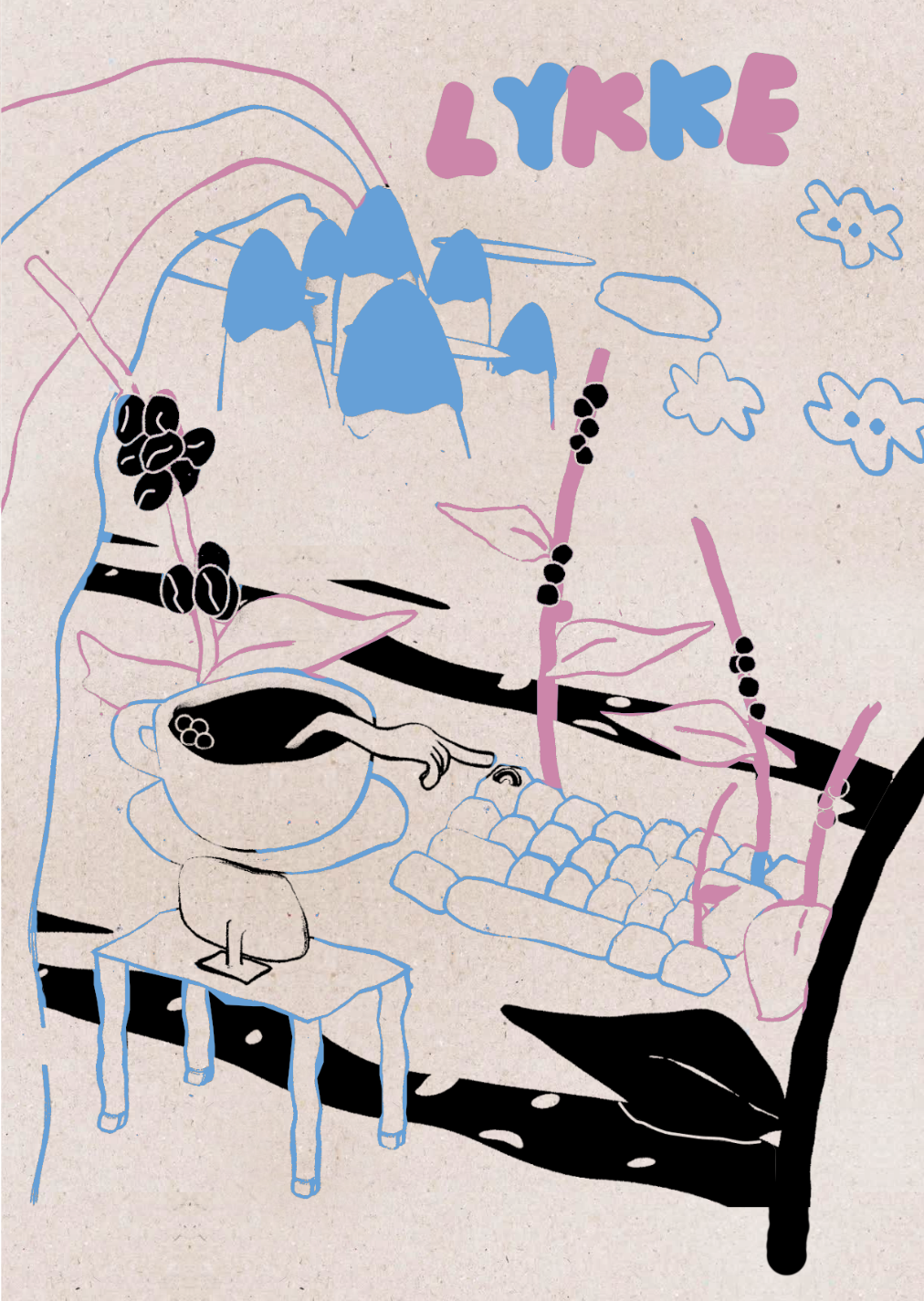
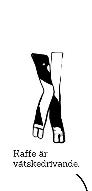
By combining humor with credibility, we create an engaging and memorable campaign that highlights Lykke’s unique selling proposition. We leverage our playful and colorful visual identity, using illustrations that reflect our journey from farm to desk, while offering creative and thoughtfully designed products that leave a lasting impression in the workplace.
Campaign Statement
Some say a good day starts with coffee.
We say a better future starts with Lykke.
Specialty coffee. Office coffee. After-lunch coffee. Running-late-for-a-meeting coffee. A beloved thing has many names. And what defines Swedish working life more than coffee?
From small startups to large corporations, the coffee ritual is ever-present and unquestioned. Few people spare more than a passing thought for where the beans came from or how they ended up in the break room—as long as the caffeine does its job.
But somewhere along the way, the coffee industry lost its direction.
The journey from plant to cup is too often marked by compromises—for both the planet and the people behind every bean. What satisfies a craving in the moment can leave a bitter aftertaste once you understand the true cost a single sip may have on our future.
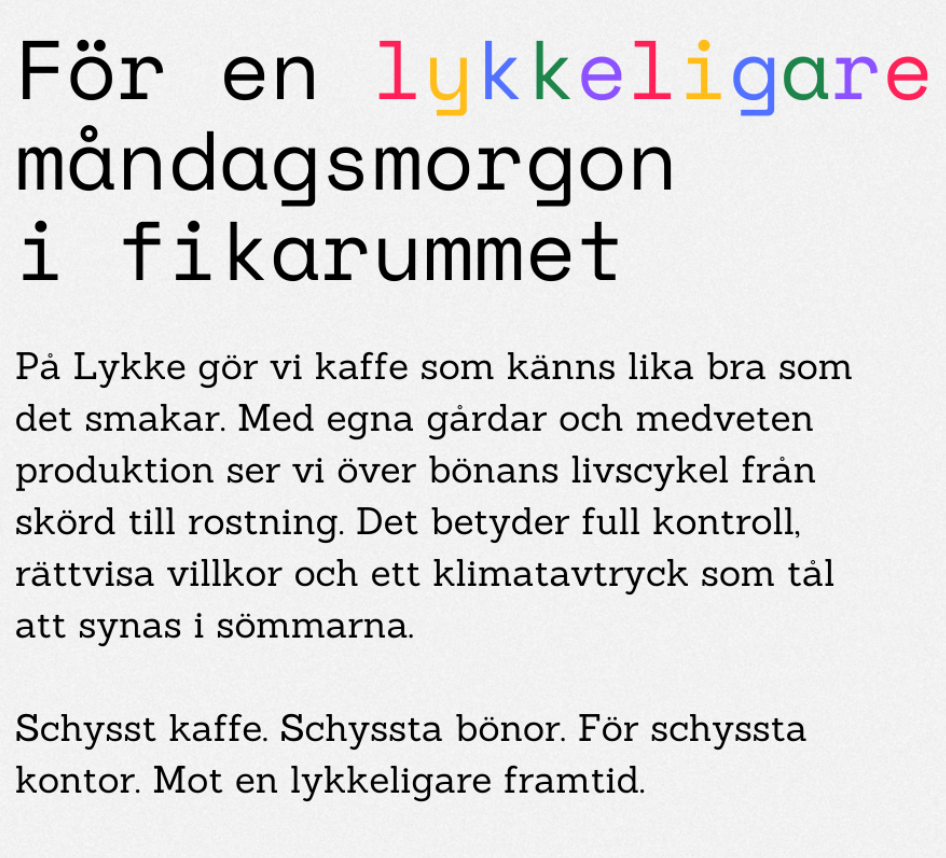
At Lykke, we make coffee that feels as good as it tastes.
With our own farms and a conscious approach to production, we oversee every stage of the bean’s lifecycle—from harvest to roast. That means full transparency, fair conditions, and a climate footprint that stands up to scrutiny.
Good coffee. Good beans. For good offices.
Towards a happier future—with Lykke.
Campaign overview
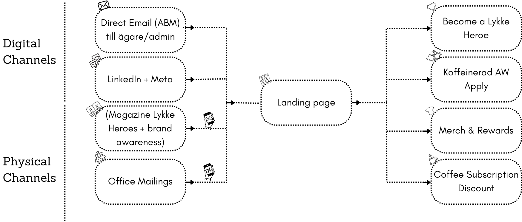
Lykke Heros + Brand Awareness
Part of the campaign idea was to interview and feature studios and office owners who integrate sustainability into their lifestyle or business approach. We called them Lykke Stars.

The set design integrates Lykkes iconic illustrations into their workplace/studio enviroments.
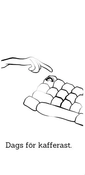
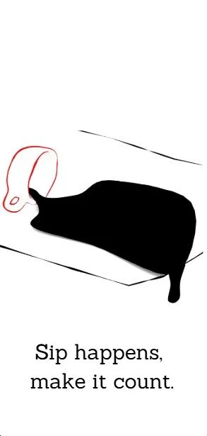
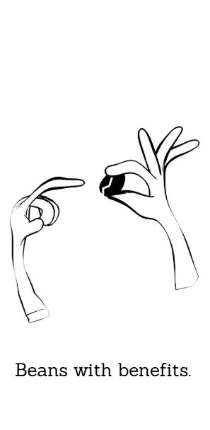
Social Media Posts
By combining humor with credibility, we create an engaging and memorable campaign that highlights Lykke’s unique selling proposition. We leverage our playful and colorful visual identity, using illustrations that reflect our journey from farm to desk, while offering creative and thoughtfully designed products that leave a lasting impression in the workplace.

The Landing Page

Office Mailings
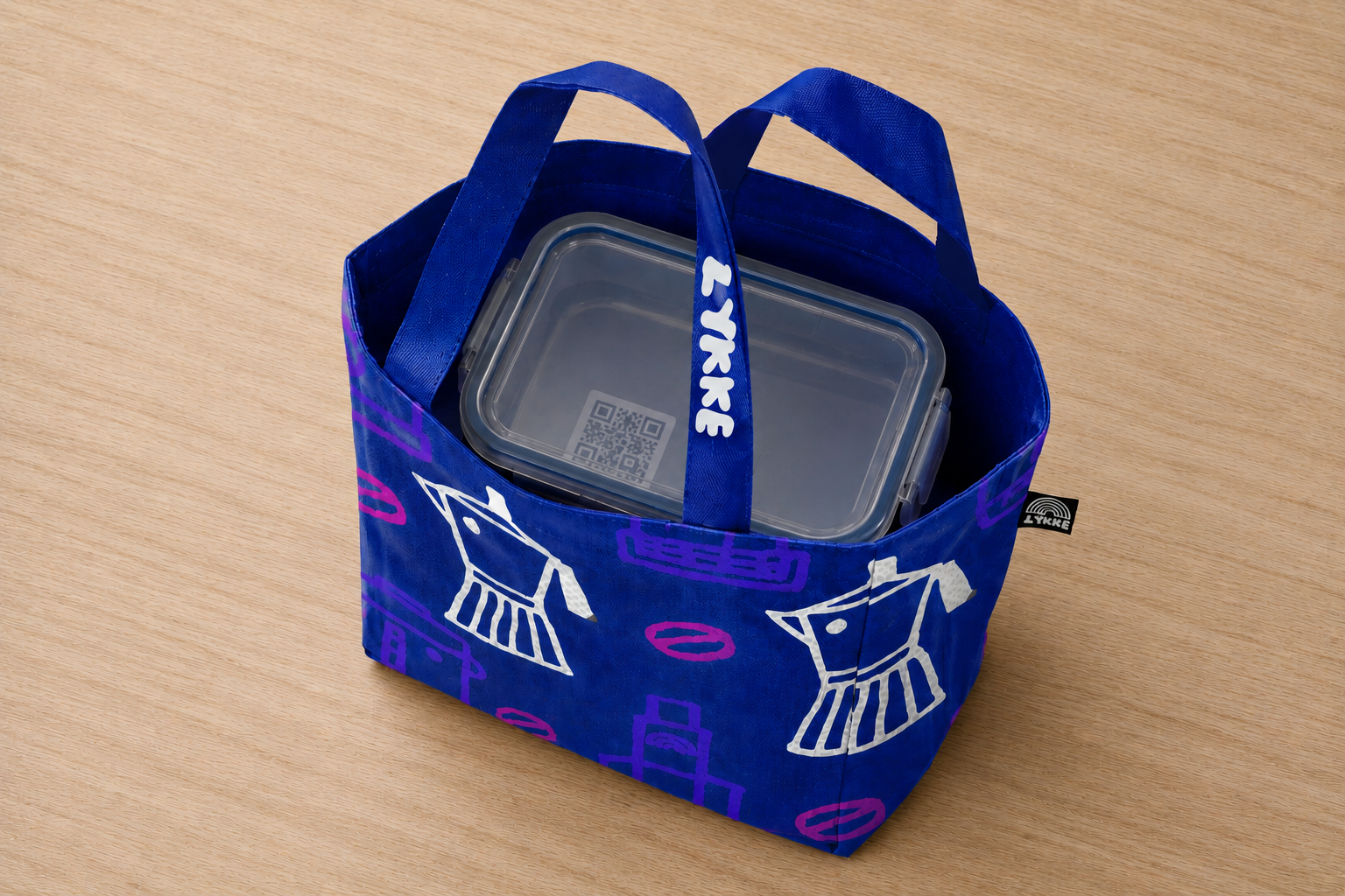
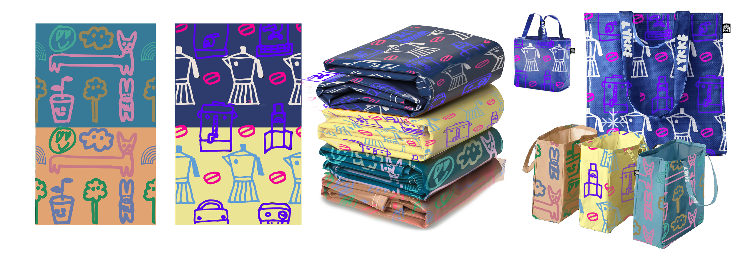
The campaign involved designing bags that can be used in the workplace like lunch bags.
Lykke's iconic doodles are used in the form of colored patterns. Instead using Lykkes logo directly, a hint of the brand visual identity can make the product much more useble.

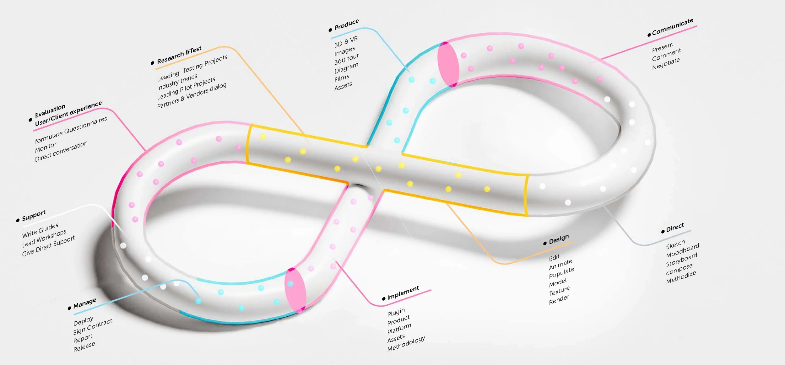
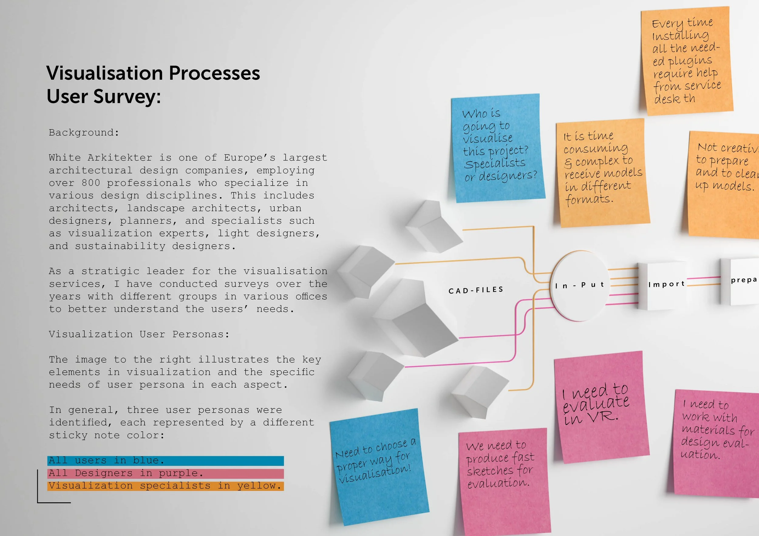
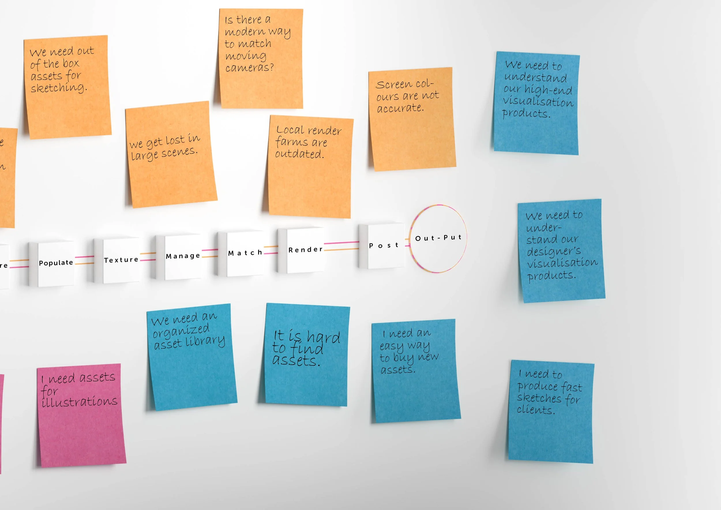
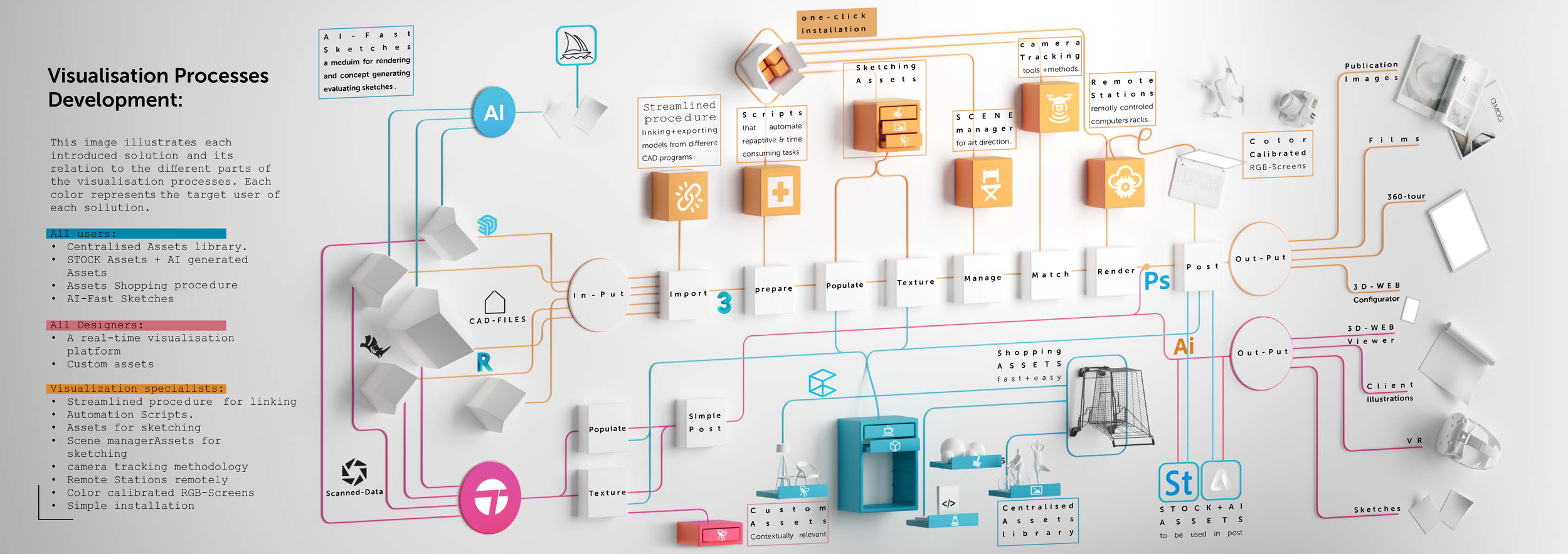
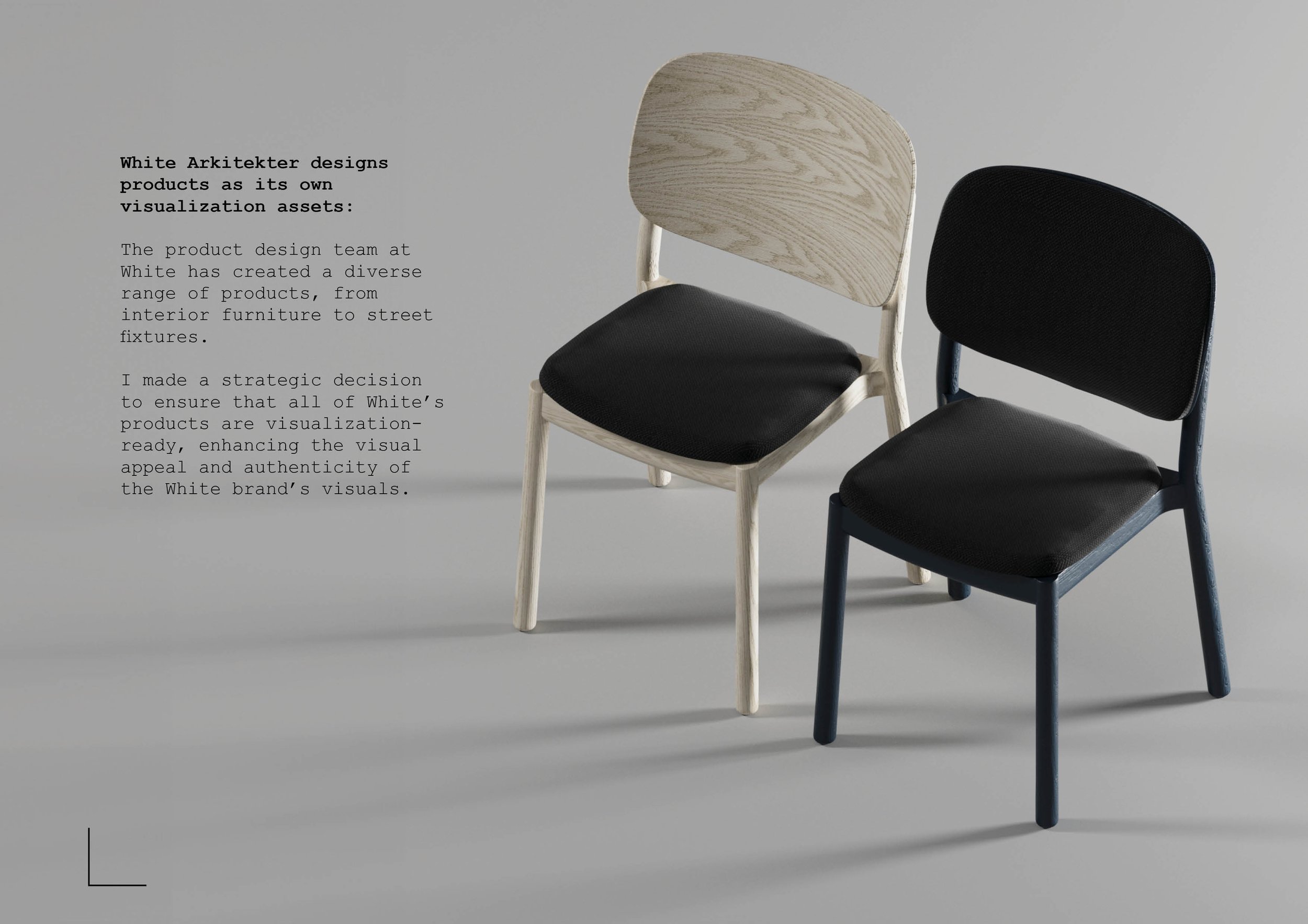
Case 3: White Arkitekter
Creative and process leadership